Vega for LiaScript: Interactive Data Visualizations in Your Course
- André Dietrich
- Template , Tutorial
- May 28, 2026
Data visualization is central to data science, statistics, and quantitative research education. Good charts communicate insights that tables cannot. Interactive charts — where students can hover, filter, and explore — communicate even more.
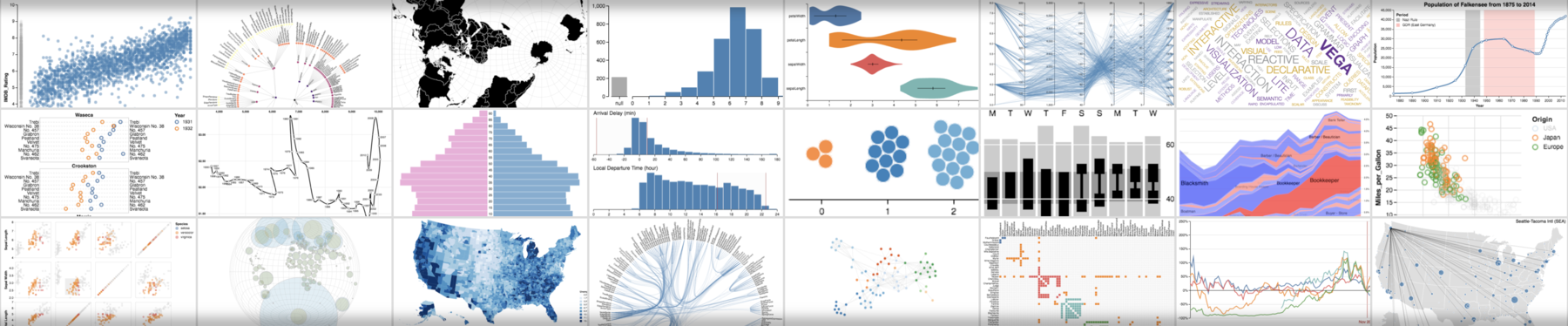
The Vega template brings Vega-Lite to LiaScript. Write a chart specification as JSON; the template renders it as a fully interactive visualization using the Vega stack.
Quick Start
<!--
import: https://raw.githubusercontent.com/liaTemplates/vega/master/README.md
-->
Two macros: @Vega.exec for an editable chart and @Vega.run in the fence opener for a rendered-only chart.
Macro 1: @Vega.exec — Editable Chart
@Vega.exec is attached at the end of a JSON code block.
The block is shown to students, who can modify the specification and click run to re-render.
```json
{
  "$schema": "https://vega.github.io/schema/vega-lite/v4.json",
  "data": {
    "values": [
      {"subject": "Math",    "score": 82},
      {"subject": "Physics", "score": 76},
      {"subject": "CS",      "score": 91},
      {"subject": "English", "score": 68},
      {"subject": "History", "score": 74}
    ]
  },
  "mark": "bar",
  "encoding": {
    "x": {"field": "subject", "type": "nominal"},
    "y": {"field": "score",   "type": "quantitative"}
  }
}
```
@Vega.exec
Macro 2: @Vega.run — Silent Rendering
@Vega.run is placed in the fence header.
The JSON specification is hidden from the student; only the rendered chart is shown.
This is useful for charts that serve as illustrations rather than exercises.
```json @Vega.run
{
  "$schema": "https://vega.github.io/schema/vega-lite/v4.json",
  "data": {"url": "https://vega.github.io/vega-lite/examples/data/seattle-weather.csv"},
  "mark": "tick",
  "encoding": {
    "x": {"field": "precipitation", "type": "quantitative"}
  }
}
```
Vega-Lite Chart Types
Vega-Lite supports all standard chart types via the "mark" property:
| Mark | Chart type |
|---|---|
"bar" | Bar chart (vertical or horizontal) |
"line" | Line chart |
"point" | Scatter plot |
"area" | Area chart |
"tick" | Strip plot (distribution) |
"boxplot" | Box-and-whisker plot |
"rule" | Reference lines |
"text" | Text labels on chart |
All marks support aggregation ("aggregate": "mean", "count", "sum"), color encoding, tooltips, and interactive selections.
Scatter Plot Example
```json
{
  "$schema": "https://vega.github.io/schema/vega-lite/v4.json",
  "data": {"url": "https://vega.github.io/vega-lite/examples/data/cars.json"},
  "mark": "point",
  "encoding": {
    "x": {"field": "Horsepower", "type": "quantitative"},
    "y": {"field": "Miles_per_Gallon", "type": "quantitative"},
    "color": {"field": "Origin", "type": "nominal"},
    "tooltip": [
      {"field": "Name", "type": "nominal"},
      {"field": "Horsepower", "type": "quantitative"},
      {"field": "Miles_per_Gallon", "type": "quantitative"}
    ]
  }
}
```
@Vega.exec
Full Template Demo
Use Cases
Data science courses — Teach exploratory data analysis (EDA) by showing students live charts they can modify.
Change the mark from "bar" to "line", add a color encoding, switch from count to mean — all without writing code.
Statistics — Illustrate distributions, histograms, and box plots. Students can load a real dataset from a URL and explore it visually.
Research methods — Show the difference between chart types for the same data. A scatter plot, bar chart, and line chart of the same dataset tell different stories.
STEM and engineering — Plot sensor data, simulation results, or experimental measurements as interactive charts embedded in the course material.
Technical Facts
| Runs in browser | Yes |
| Server required | No (for local data) |
| Data sources | Inline JSON values or remote CSV/JSON URLs |
| Editable version | Yes — @Vega.exec |
| Vega version | Vega 5.9.0, Vega-Lite 4.0.2 |
| Interactive features | Tooltips, selections, hover effects |
| License | MIT |
| Maintained | Stable (version 0.0.2) |